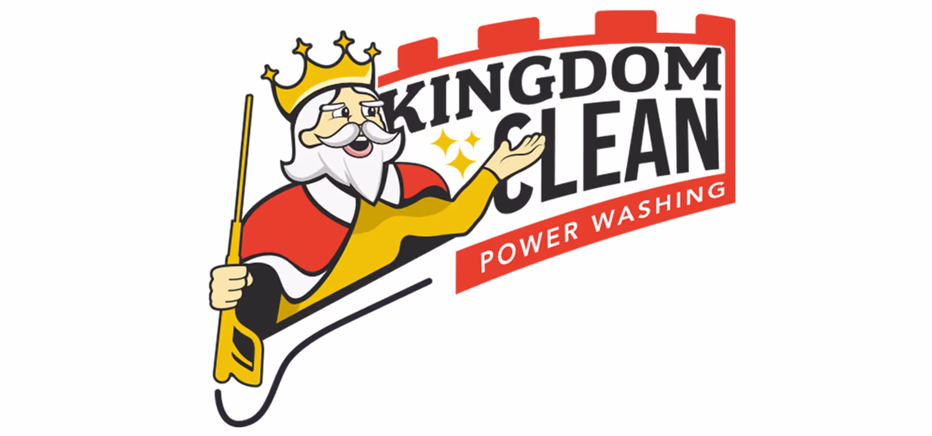
Here is the developed logo in Illustrator based on the original sketch. During this stage, I realized there were too many elements competing for attention, which caused the design to feel cluttered. Because of this, I removed the “castle” concept to improve legibility. I also knew I wanted the three star shapes to represent the “clean” aspect of the logo.
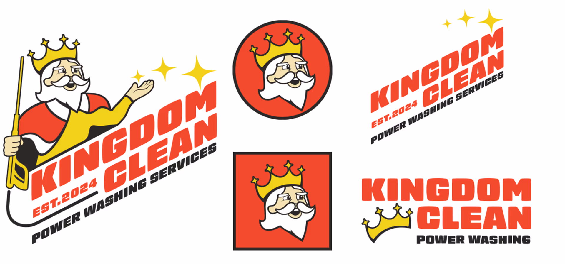
The final design is cleaner and more legible, accomplished by placing the text beneath the character. Reducing the color palette streamlined printing and created more visual space for the three stars.
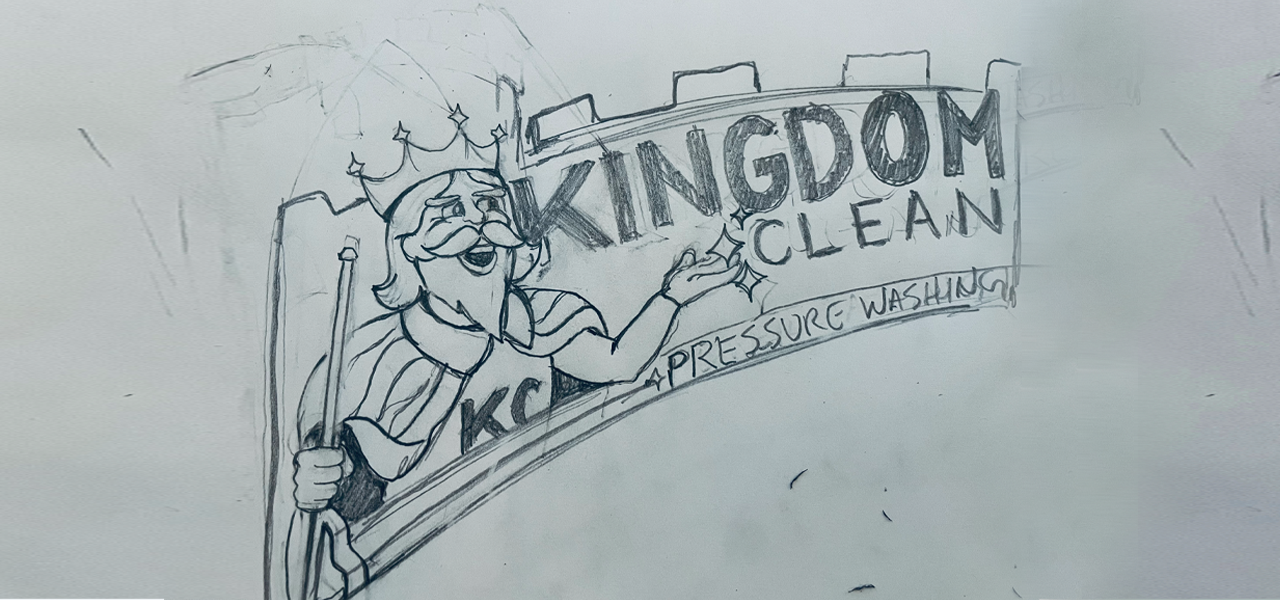
This project was created for a friend launching a power washing company in Kansas City, MO. He wanted the brand identity to echo the Kansas City Chiefs’ visual style while featuring a cartoon-style “king” character as the primary logo.
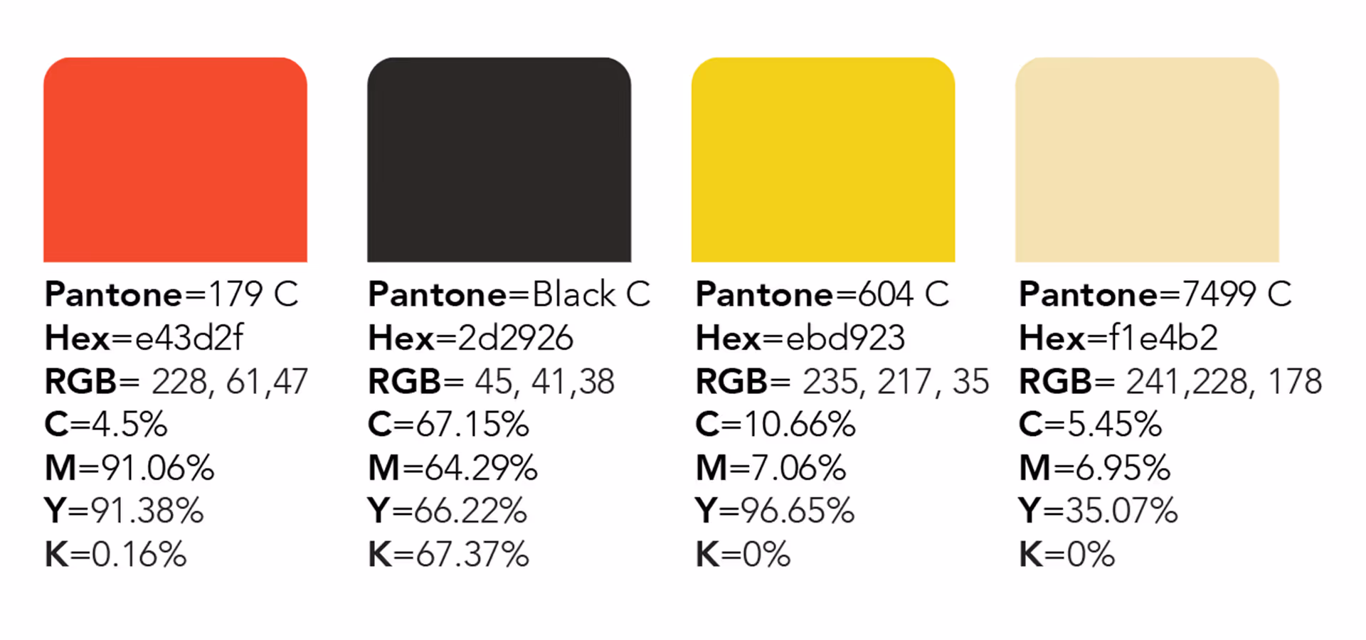
Because the logo needed to align with the Kansas City Chiefs’ identity (Chiefs Kingdom), the color palette naturally centered on red and yellow. From there, I applied my illustration skills to develop a sketch that brought the client’s concept to life and matched the style he envisioned.
The reasoning behind this project is reflected not only in the straightforward concept provided by the client, but also in the supporting design elements. The pressure washer in the king’s hand and the sweeping motion over the wordmark create a clever representation of the company’s service. Meanwhile, the three stars reinforce the message of trust and reliability, signaling to customers why they can depend on Kingdom Clean for any pressure washing needs.
The final logo aligned perfectly with my client’s vision. It features a cartoon-style king holding a pressure washer, positioned above the Kingdom Clean wordmark. The three star-shaped symbols complement the typeface and reinforce a sense of reliability, suggesting to customers that Kingdom Clean can handle any cleaning task with confidence and quality.
Ready to take the next step? Contact me today to request pricing for your logo. My goal is to bring your vision to life. Let's work together to achieve that!
CONTACT