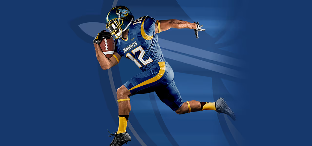
The objective for this project was to create a sports symbol with a custom typeface.
My approach with this project was to take an older sketch and turn the sketch into a workable sports logo that showcases movement and strength. Also, creating an image that leans more into my illustration skills.
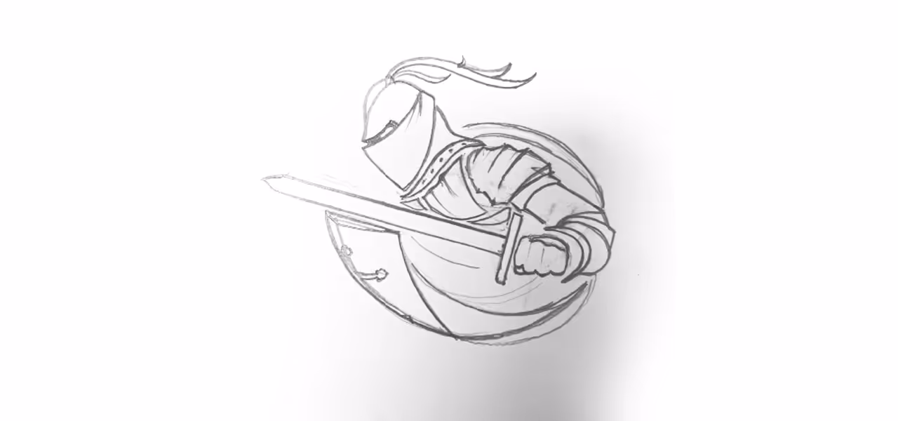
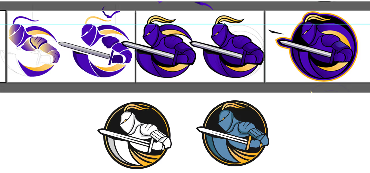
The sketch introduces movement around the “knight,” illustrating the progression that leads into the final image. The rounded, clockwise motion guides the eye naturally toward the sword. I removed the original concept of movable shapes in the upper right, as they created unnecessary visual clutter. In their place, I added three strokes between the sword and shield, reinforcing a cohesive sense of motion and creating a more unified composition.
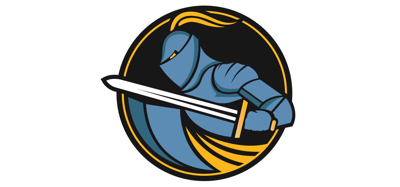
The final logo resembles a strong, quick-moving image depicting a clean logo illustration of a knight holding a sword.
Ready to take the next step? Contact me today to request pricing for your logo. My goal is to bring your vision to life. Let's work together to achieve that!
CONTACT