
The objective of this project was to challenge myself with a full logo redesign and prove that I could deliver a polished solution for a real client. This was my first freelance design project, and my focus was to create a clean, simple, and immediately understandable visual identity.
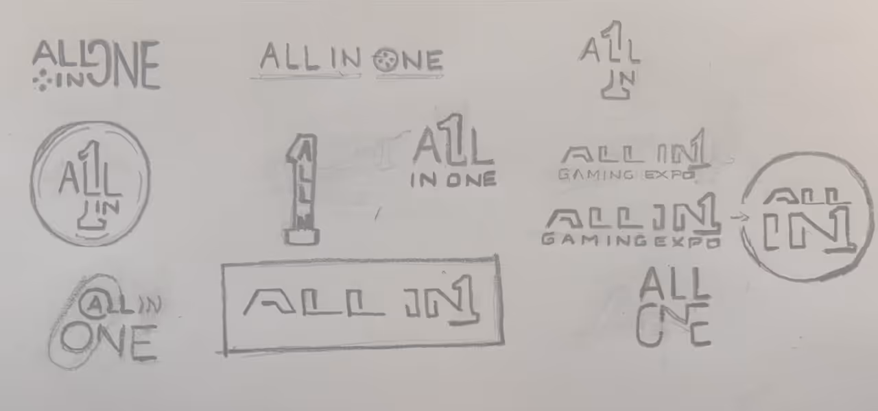
The original logo featured a large number “1” filled with a long list of their offerings—Bar, Tabletop, Outdoor, PC, and more. This created visual clutter and made the logo difficult to read. My first priority was to eliminate the congestion and allow the design to breathe. Simplifying the structure was essential to improving clarity and usability.
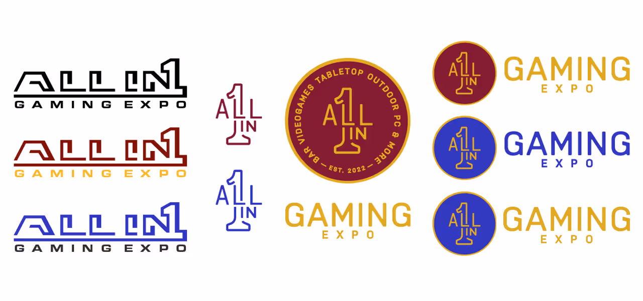
The client requested a circular mark to resemble a gaming token. With that direction in mind, I developed a concept built around the brand name “All In One” and the number 1 as the core visual element. The design needed to feel unified while still conveying the idea of “everything in one place.”
The final logo is a clean, modern identity inspired by a token shape. The brand name and the number 1 are integrated into a single cohesive symbol—part of the “L” in ALL and the “I” in IN form the structure of the number 1, reinforcing the concept of unity. The result is a simple, memorable mark that reflects the brand’s message without unnecessary complexity.
Ready to take the next step? Contact me today to request pricing for your logo. My goal is to bring your vision to life. Let's work together to achieve that!
CONTACT